Gain insight of Google Analytics on my tech blog via Power BI
I have this tech blog for more than 2 years. The blog is built on Github pages, which can be tracked by Google Analytics. I used to go to Google Analytics to see some web activity stat. I have to say Google Analytics did a very good job from tracking to presenting data with various visualization. One drawback though, it has some preset params, like previous week. If I want to see what is going on today, I need to change that at drop down list. In addition, there are some charts I am not interested. It seems there is no options that I can personalize the chart presented. Since Power BI can connect to Google Analytics and retrieve data. I am wondering if I can retrieve data and set up desired chart in Power BI. Next time, if I want to check the web stat, the only thing I need to do is to hit the refresh button.
First, let us define what I want to see in the dashboard.
- I want to know some key statistics, such as total page view, total session, I also want to know what the maximum page view number is within a single day. This one is not available from Google analytics. I will create this measure with DAX in Power BI.
- Show user number and new user number over time. This will be displayed in line chart, so that I can have an idea of my consumers.
- Show which post is popular
- Where are my consumers from? It is always interesting to me that people from different countries are working on the same thing. It is a small world indeed.
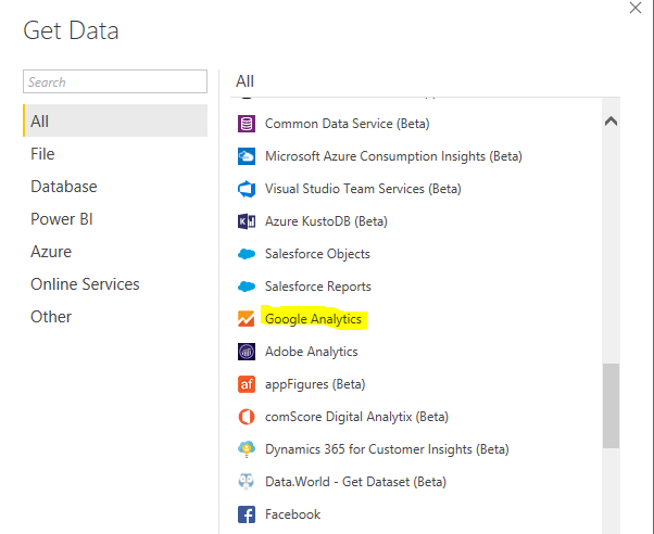
We need to get data from Google analytics. In Power BI, it is easy to do. There is a connection as follows. Just follow the instruction. You will be able to load data.
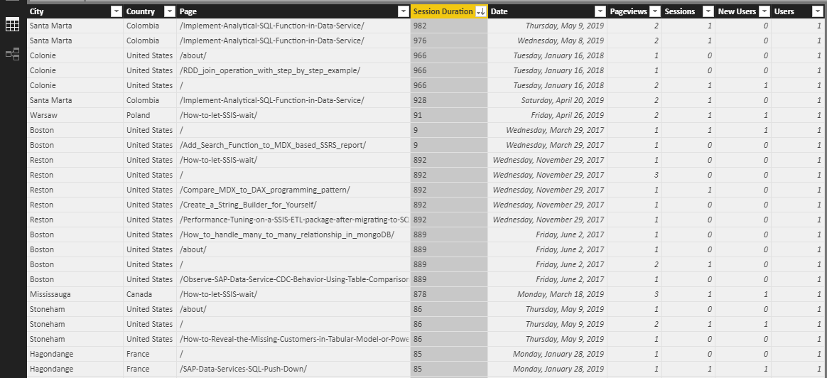
I only choose the dimension and measure I am interested. The following is the part of data.
Here I create a new measure as follows

For people who is not familiar with DAX. This first calculate total user number in each day, then pick the highest single day total user number. This measure will dynamically change when you change different time period. For example, if you choose year 2017 vs year 2019. It will calculate the highest single day total user number in chosen period.
With measure ready, I start to build chart. This is a draft.
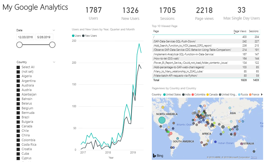
As you can see, I have key measures on top and slicers on the left, which I can slice the data based on time period and specific country.
The line chart show total users and total new users number over each month. Total user increase on an exponential growth curve. After first half of 2018, user number increase rapidly. This is my explanation, when at the beginning, I published a few posts, which are not noticed by other users. Once a user feels the post is valuable, he/she will share the link somewhere. So, more and more people will visit my posts. In addition, I constantly write tech blogs. As blog number increase, it will have more chance to attract users.
Which blog is popular? The first one is home page, it is probably because people like to go to home page after they complete reading a specific tech post. Besides that, the top posts are talking about SAP and Microsoft BI tool. I came across some issue in my work, I finally resolve it and share my experience. Those are original and helpful to others. That is why they are popular.
Where are my user from? They are all over the world except the regions in central Asia and central Africa. I guess this has something to do with poor local economy. It is not surprising to see USA and India (bigger circles) are among the country which has most page views. Surprisingly, Columbia in South America also on the top in the list. Maybe this country is also strong on IT.
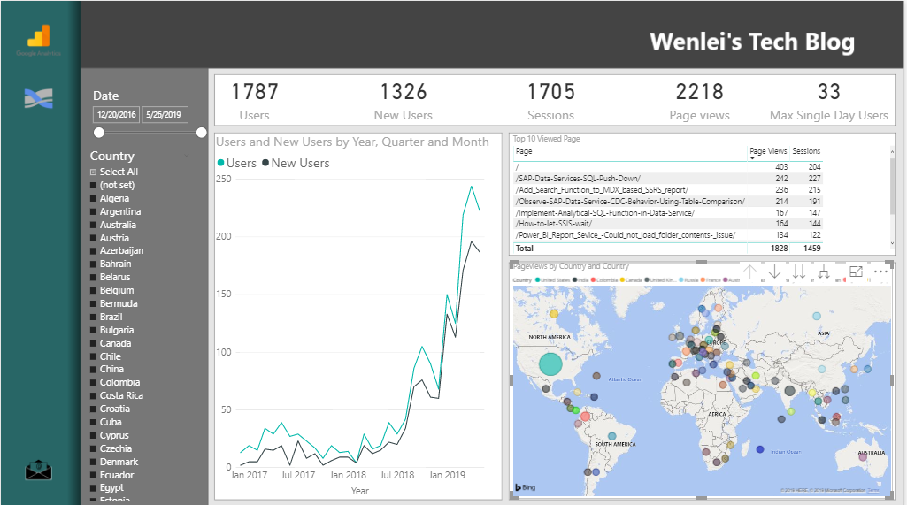
To make the dashboard look more professional, I use Adobe XD (free) to create a background.

Here I add navigation panel on the left, contain Google Analytic logo, also Sankey chart icon (which I can use as button to jump to another bookmark, this will be a future project). For the rest, I put chart in different compartments outline by Adobe XD.
Now I use this image as background, the dashboard looks much better
Notice, the end date of this dashboard is 5/26/2019. I want to refresh it today. I just hit refresh in Power BI. It will automatically refresh as follows.

Thanks. Happy BI
Wenlei