How to Evaluate Your Machine Learning Model
Given a scenario, after a few days of hard work, you have a model built, are you done?
Unfortunately, It is not the end of your data science project, it is a new start of many other things!
I will need to validate a few things (just my list not exausted one though) so that we know the model is good.
- Besides good performance metrics score, what are the important features which support prediction? We can use business knowledge to cross check. We can ask ourselves, Does that make sense?
- It would be good to check visually whether model is overfitting and underfitting
- If it is imbalance data, what threshold is optimized to choose from
- Other useful chart to check model performance
It is easier to explain with an example, so let us use the previous project to explore the question we listed. For details of the previous project, I include the link here.
First, I need to import the pickle file I saved from the previous project. In order to do that, I need to import all packages, custom classes, functions used as I know it will run into errors without those.
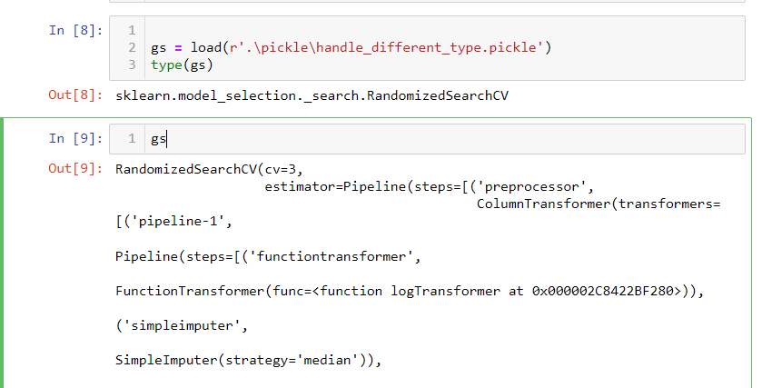
In cell 8, I imported sklearn.model_selection object. when you look at the import object, it shows the pipeline detail.
1. feature importance
In some industries, model explainability is crucial. Imagining we built an insurance pricing model, but we cannot explain how the model works. When we submit the model to the state regulator for approval. We will fail because regulators need to know why we increase insurance premiums. Over the past 20 years, there have been a few important machine learning frameworks such as scikit-learn, deep learning et al. Depending on different models, scikit-learn generally provides model properties to reveal the model importance; whereas deep learning framework is famous for its blackbox due to hidden layers despite of fairly high performance. Since I used scikit-learn in my previous blog, I will focus more on some of the ways in scikit-learn.
In Dr. Bronlee’s blog, he illustrated three important ways to get feature importance.
https://machinelearningmastery.com/calculate-feature-importance-with-python/
- Coefficients as feature importance if it is linear model
- Tree based feature importance (Decision tree, Random Forest, XGBoost et al )
- Permutation feature importance, (Pass scrambled predictors to model to check performance drop to get importance)
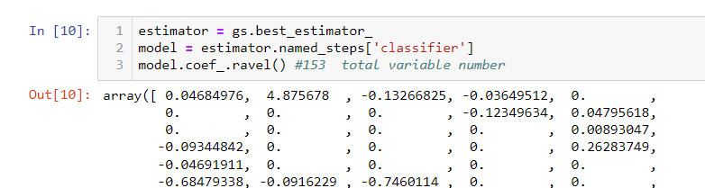
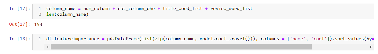
The optimized model in my previous project is logistic regression. It is the linear model, let us use the first method, i.e. coefficient method. We can use name steps to retrieve the model directly from sklearn.model_selection object. Using its property coef_, We can see 153 features. The particular coefficient indicates how much impact this feather can impact. Please note, your data needs to be scaled to a similar level. In my case, all values are scaled between (-1, 1). So the impact between each feature is relatively comparable.
With the coefficients in place, we will need to map the feature name to it.
In my previous blog, I have numeric features, categorical features and text features.
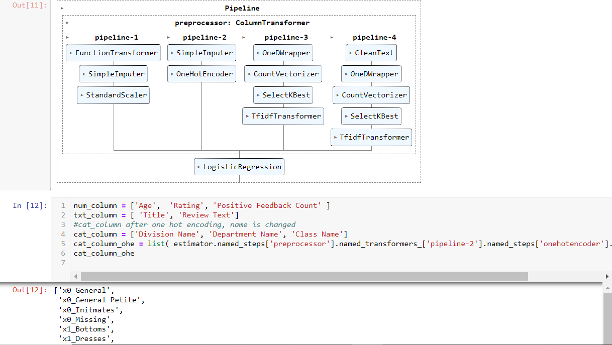
Num_column, categorical_column, Title in txt_coloumn and ‘Review Text’ in txt column passed through pipeline-1 ~ pipeline-4 within the column transformer respectively. After the transformation, the results are in the sparse matrix format. Unlike dataframe, this format does not have column names. So in order to know the feature importance, we will have to retrieve the feature name if they went through something like one hot encoding, which will expand one column to multiple columns.
Let us see how we get the feature name for the sparse matrix.
First of all, they follows sequence how you set the pipeline up (pipeline 1 to pipeline 4).
- Num_column: just simple imputing and scaling. The column number has not changed.
- Categorical column: it has the column expanding transformer, onehotEncoder. Luckily, scikit-learn provides functions such as named_steps, named_transformers (see cell 12 line 5) so that you can navigate to the onehotencoder step. Then you can use get_feature_names() to get all feature names (not shown in the screenshot, too wide, but in notebook). Notice here, scikit-learn renamed the three variables (Division, Department, Class) to X0-X2. By the way, showing pipeline like cell 11 is helpful for you to navigate complicate transformation
- For text columns, I divide Title and “Review Text” into two pipelines (3 and 4). Text is tokenized into words (column expanding). We select 20 and 100 important words respectively with selectKBest transformer (column number changed too). These Text values are later used as column names.
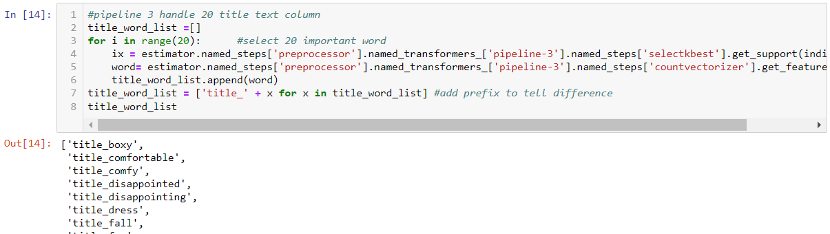
Here we can first get the word index from selectKbest step. Then use the index to get actual words from the previous step countvectorizer. There are 20 in Title, so I loop 20 times and rename the column to add the prefix ‘title’ to distinguish words from ‘review’ . For Review Text, it works similarly. But just change 20 to 100.
Next, I piece together all the feature names and combine them with coefficients.
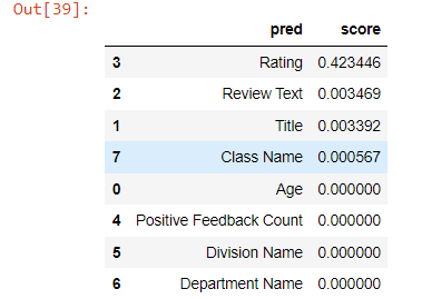
Let us see what those important players are.
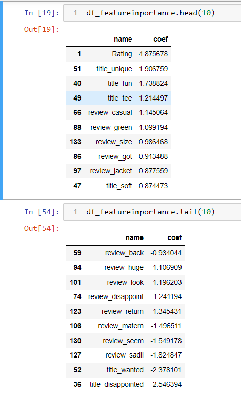
I listed the top 10 and bottom 10 important features. Notice bottom 10 is also important. It just negatively impact the prediction towards negative target (not recommended, target =0).
By reviewing those features, it makes much more sense to me. Rating definitely positively correlated with recommended (target =1), I don’t see categorical features play an important role here. Probably those are neutral. Others, in the top 10 features, are mainly good words. Bottom 10 features are mainly bad words. Only question here is title_wanted in bottom 10, meaning the word “wanted” in the title. I would think this is a positive word. But maybe, I don’t understand fashion. In the fashion world, if other people want it, it might not be a good thing. But it is worth taking time to see what original context to see if this is the case and make further adjustment.
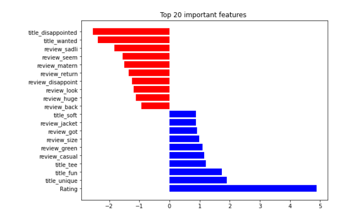
if we visualize it with bar chart
These analyses are all at the detailed level, I often ask myself. What if we treat expanded categorical/text features into one feature. As a whole, what feature importance landscape would be?
For that, we can use permutation feature importance calculation. Idea is as follows.
We already had a model and we knew performance would be. Now if I scramble/shuffle a feature value and pass the dataset to the model, you will see performance drop. If that particular feature is important, the drop is higher.
The following is the process. I modified part of the code from this blog.
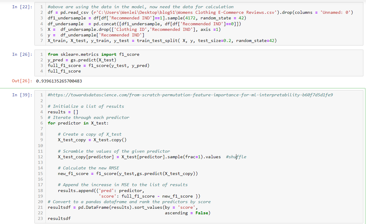
Before this section, I didn’t need source data, because all model related data is pickled and you can retrieve from pickle. Since I need to do some data scrambling. I re-imported data and did a prediction at cell 26 and used f1 as performance metrics. We get f1=0.94 without scrambling. Now in cell 39, we loop through each column, in row 12, we shuffle the record. We recalculate the f1 score and compare it with the baseline at row 19. Then we put all change into a dataframe and sort it.
From the result, still you will see Rating is the most important feature. Two text features are still rank 2 and 3, but value wise is not as important as the detail level. This makes sense, because it contains both positive and negative words, which might balance the impact as a whole.
There is a popular feature importance package called Shap. The difference between permuation importance and Shap is: the former is determined by performance metrics drop, while the latter is magnitude of feature attributions. Shap can also explain deep learning models. So check it out
2. Model quality
Generally, if you see your model perform well with your test dataset. It is a good sign. But it is reassuring for you if you have a chart to show the learning curve. In Marcelino’s blog, he has two functions which I think are useful.
https://www.kaggle.com/code/pmarcelino/data-analysis-and-feature-extraction-with-python/notebook
The function can be found in my notebook as well, download link are list below
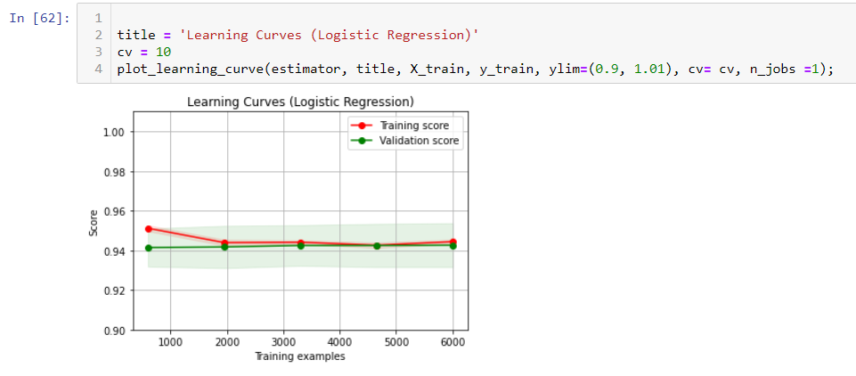
Basically, if your learning score is high, there is no underfitting. If you don’t see an obvious space between two curves, there is no overfitting. In my case, I don’t see obvious underfitting and overfitting.
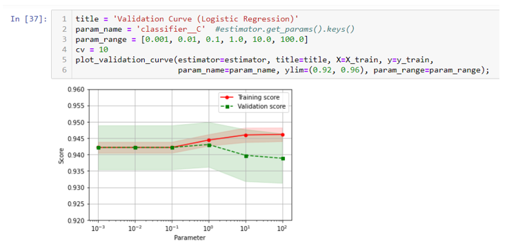
The second function is used to check hyperparam. You can see at 10e-1, the two curves start separate. Looks hyperparam C should be chosen 10e-1 or lower. This is consistent with the best param in the previous blog.
3. optimize the threshold
When doing classification, the algorithm gives a possibility for each record, then the final label is assigned by comparing the possibility with the threshold. By default, the threshold is 0.5. But it is not always the case. I have seen the optimized threshold at 0.05 for some imbalanced dataset. How do you find the optimized threshold ? The idea is you put together your predicted probability with your target and plot it and find the optimized threshold.
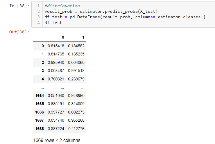
First, you use predit_prob function to get the probability.
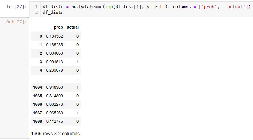
second, you list possibility with the actual label.
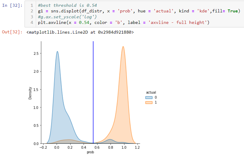
Then you can use displot in Seaborn to plot the distribution. You can find the optimized threshold point where it separates two populations well. In this particular case, it is close to 0.54
4. Other useful chart to check model performance
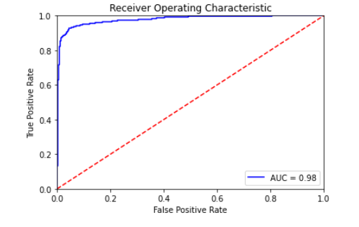
You can draw a ROC curve to see how good the performance is. You can use AUC to compare different runs.
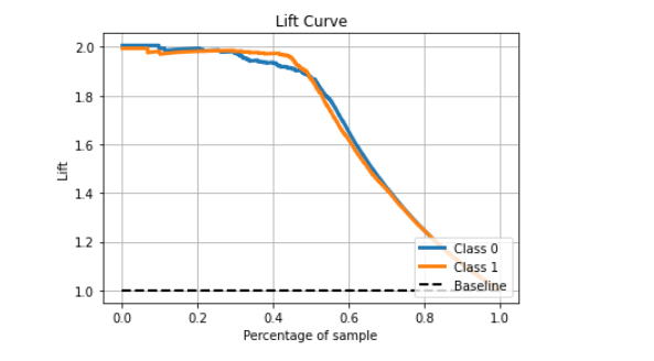
The lift chart can tell you how your model can improve prediction by comparing without a model. In this case, it improves performance by about 2 fold when you compare the top 40% sample with baseline.
To understand the lift chart, the following link will be helpful.
https://scikit-plot.readthedocs.io/en/stable/metrics.html
http://www2.cs.uregina.ca/~dbd/cs831/notes/lift_chart/lift_chart.html
Thanks for following along.
It is a long series. The notebook is here.
Keep safe.
Wenlei